Colour matching: bringing fabric and trims together
Use physical samples, consistent lighting and reference swatches to make colour decisions clearer.
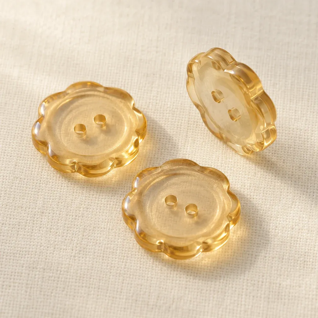
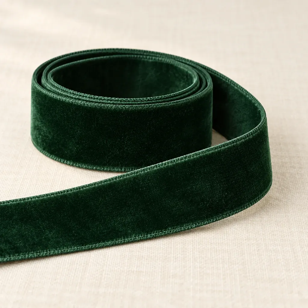
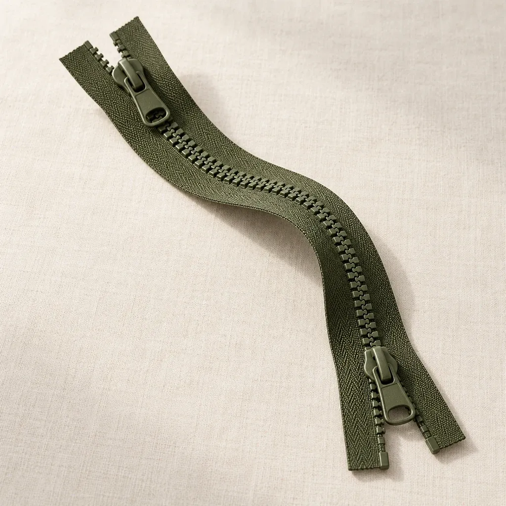
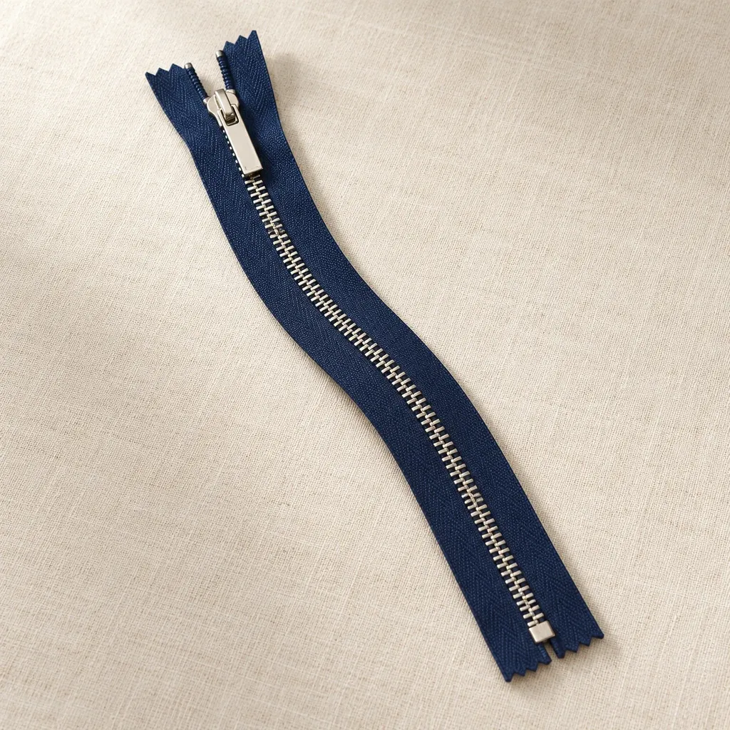
The same nominal colour can look different on fabric, a button and a woven tape. Surface sheen, texture direction and object size all influence the impression. Colour matching should therefore not rely entirely on screen images or colour names. Physical samples placed alongside the intended fabric offer a dependable starting point and help prevent different interpretations during discussion.
First decide what relationship the design needs. Related colours can let a detail blend into the garment, while contrast draws attention to a placket, waistline or edge. Compare samples under consistent lighting and at similar angles. A reflective metal part and a matte textile should be viewed together before deciding that they work well as a pair.
After selecting colours, assemble the fabric, trim and sewing thread into a reference set and note where each belongs. Keep separate sets for different colourways rather than relying on spoken descriptions. At the sample garment stage, review the balance between a large fabric area and a small accessory. Small swatches may suggest a different level of contrast from the complete garment.
Use the same viewing conditions when comparing later deliveries with the approved set. If a difference appears, describe its location and include physical comparisons or useful photographs. That is clearer than saying only that a colour is lighter or darker. Successful coordination does not always mean an exact visual match; it means that the elements support the character the design aims to express.